01 / 04
AI · home companion
Sahay
An AI home companion, from problem framing to a working prototype.
See the project →
Product Designer User Experience Designer
Marketing tells people why a product matters. UX makes sure it does. I design with both in mind.
I didn’t take the traditional route into design. I started with , moved into , and became fascinated by how products were sold to me. That curiosity led me to at Drexel, where everything clicked: marketing and UX both start with understanding people.
Today, I bring storytelling, visual thinking, and that understanding into the products I design.
01 / 04
AI · home companion
An AI home companion, from problem framing to a working prototype.
See the project →02 / 04
Games · retention
A retention-focused redesign built for Talofa Games.
See the project →
About me
I grew up in a busy city, in a big extended family. We traveled a lot, so I changed schools often and learned early how to walk into a new room and make friends.
Moving to Canada and getting into project-based work is where I found my calling: building things that make life easier for people.
More about me
I grew up in a busy city, in a big extended family, and the noise always felt natural to me. We traveled a lot, so I changed schools often and learned early how to walk into a new room and make friends. Talking to people and getting to know them has never felt daunting.
My parents worked hard to make ends meet, so I spent much of my childhood at my aunt’s place. Growing up away from home taught me to adapt and to be happy wherever I landed. What I missed most was mentorship, which is why I value it so much now.
Moving to Canada changed things. I’d been an average student for most of my life, but project-based work flipped that. Building real things instead of memorizing theory was what I’d been missing, and for the first time it felt like I’d found my calling. That’s where I found a fire I hadn’t felt before: to build things that make life easier for people.
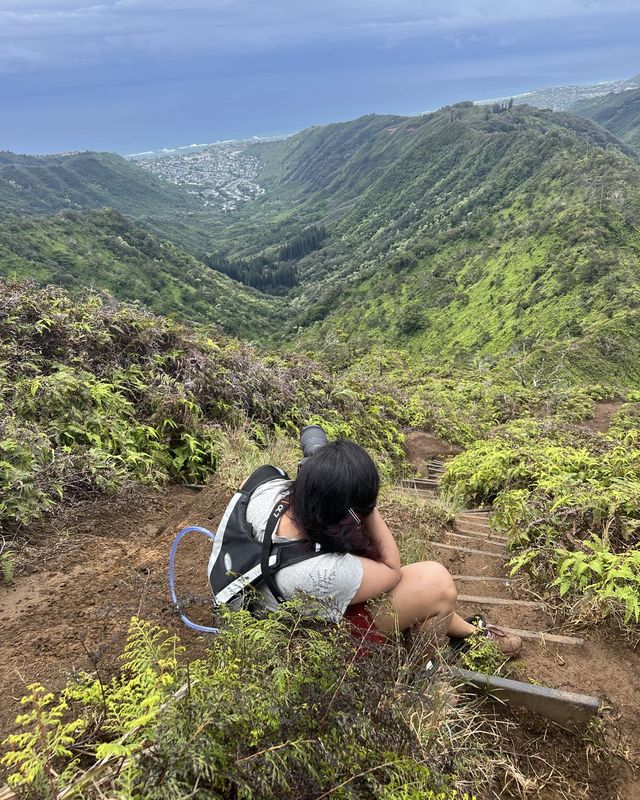
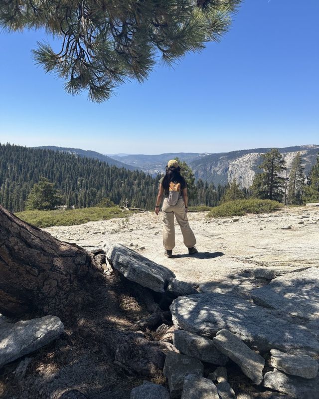
this viewpoint in Olympic National Park is one of my favorites
It reminds me how small we are, and that tomorrow doesn’t deserve as much worry as we give it.


1 / 5 · tap to flip
hiking, any chance I get





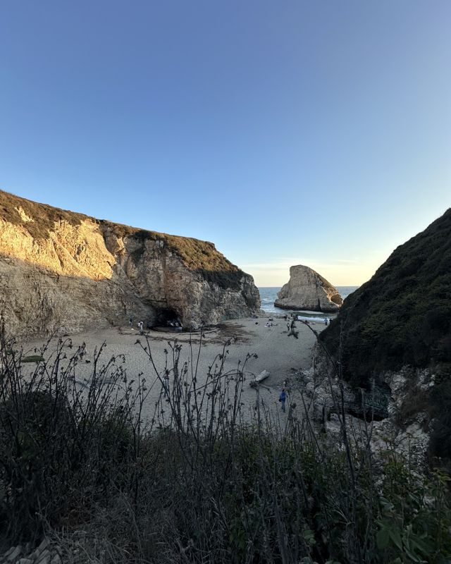
1 / 6 · tap to flip
travel grounds me
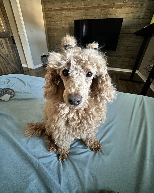
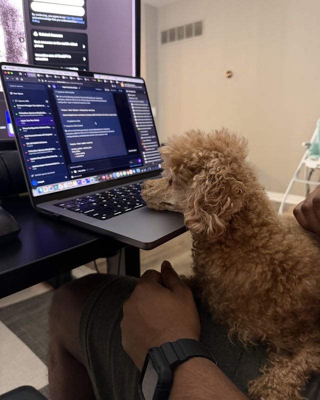

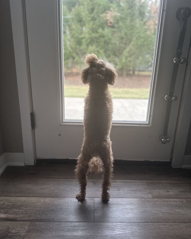

1 / 6 · tap to flip
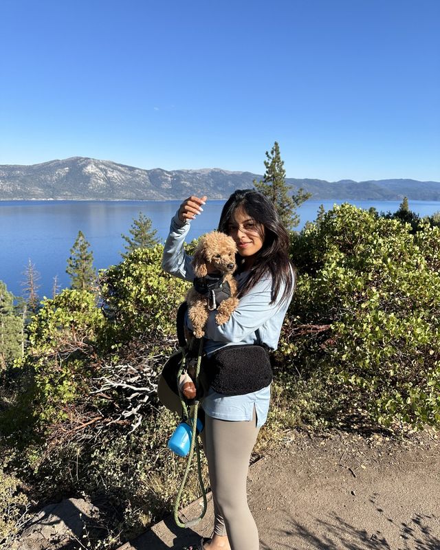
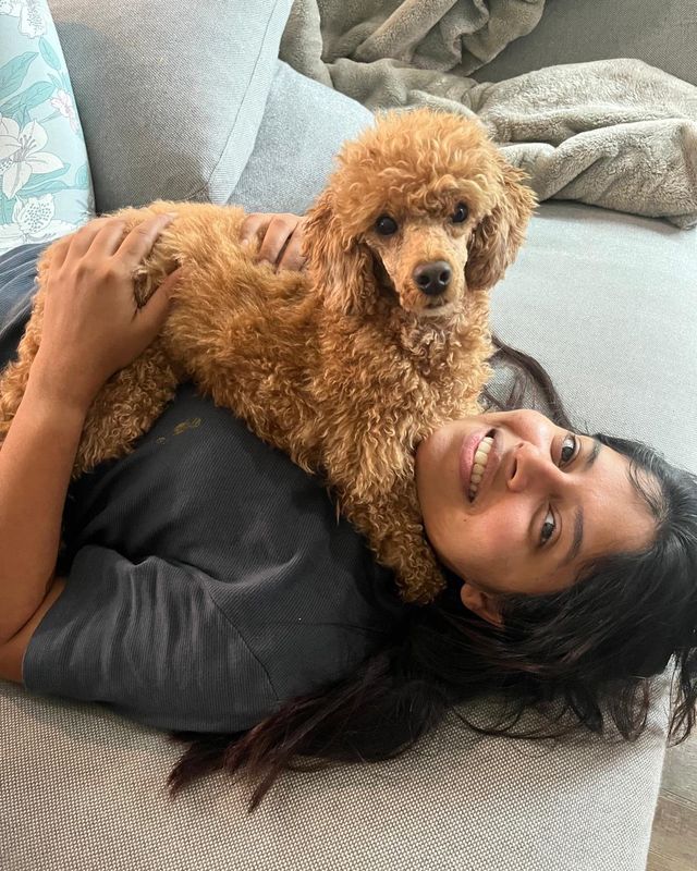
meet Ferro
dancing on stage
I’ve performed several times this year alone.
1 / 5 · tap to flip
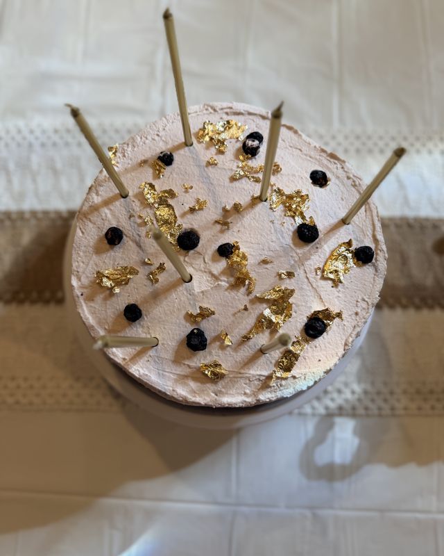
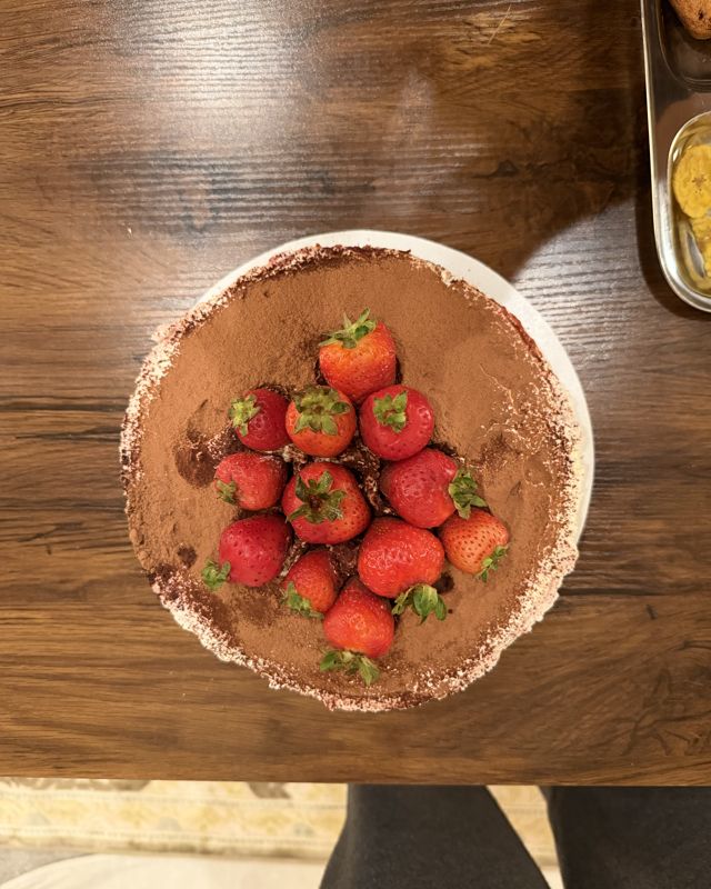
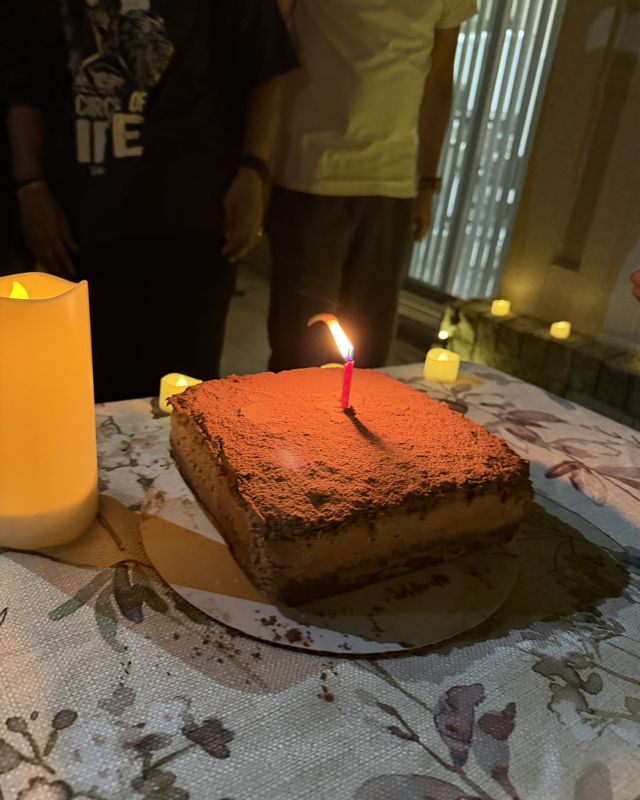
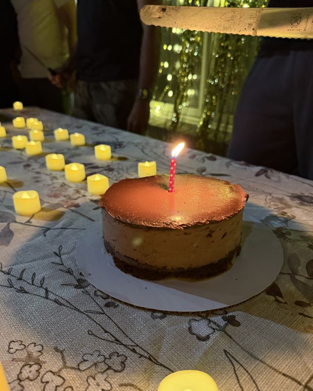
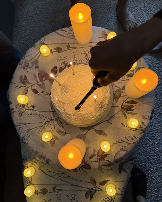
baking
About ten cakes so far this year.
also freelance photography · the occasional digital consulting project
More of what I make: Photography and Graphic design.
Photography
When I shoot, I ask what I ask of a product: does it have the effect I intended?
Photographs © Swetha Thanabalan. Please ask before using or sharing them.
Graphic design
Posters, editorial layouts, ads, and brand assets from my communication and marketing work.
Designs © Swetha Thanabalan. Client names and logos belong to their owners.

AI product design
An AI home maintenance companion that helps homeowners understand a problem before deciding what to do next.
The problem
When something breaks at home, people bounce between Google, YouTube, Reddit and contractor sites, unsure what is wrong or who to trust. Existing platforms skip straight to "find a pro."
Research
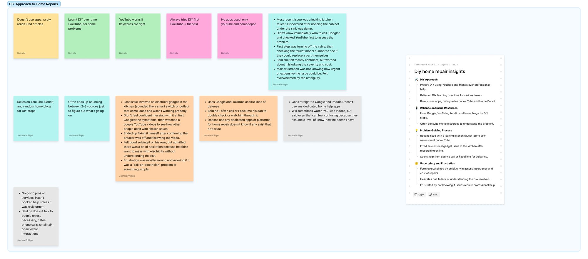
Research covered interviews and a survey with homeowners, renters and people in shared housing. Anyone who shares a living space deals with home issues: some people fix things themselves and some don't, and renters who keep track of issues are less likely to lose their deposit. Research also included an analysis of competing service platforms and marketplaces, and a map of the DIY resources people turn to.
Every competitor sent people straight to "find a pro" without helping them understand the problem first. The notes were grouped into themes, and two findings set the direction.
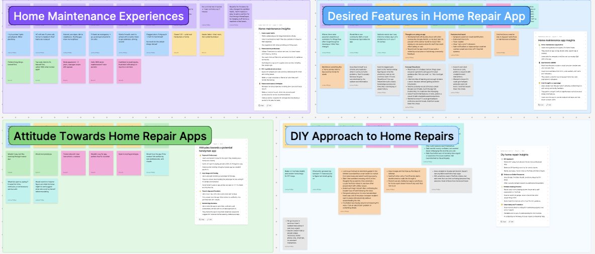
People couldn't tell how urgent a problem was, or whether they needed a pro at all.
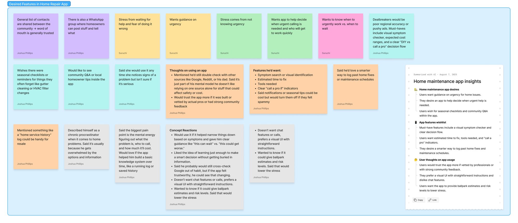
People checked five or more sources to diagnose one issue and still weren't sure how serious it was.
The pivot
The brief was to help people find contractors, and the interview questions were built around that process. In answering them, people kept talking about everything that comes before it: working out what's wrong and how serious it is. They needed confidence before deciding whether they needed a pro at all.
Designing the AI experience
Someone describes the problem and Sahay explains what's likely going on, then suggests a path that fits their DIY skill level. They decide what happens next. AI can make mistakes, so Sahay never acts for them and the final call stays with the user.
Validation
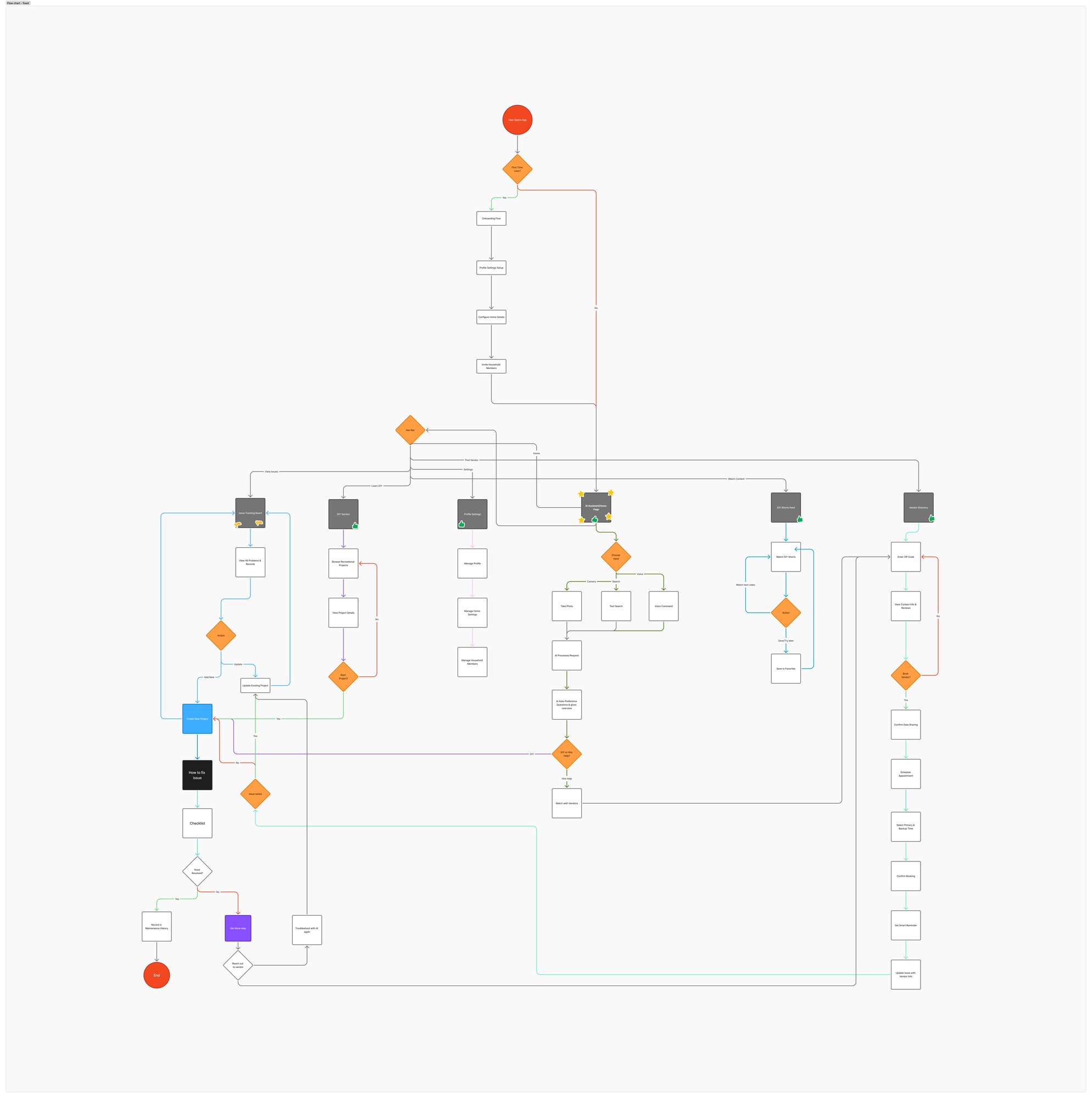
The prototype would be built with AI, so the information architecture and end-to-end flows were tested with participants first, to confirm this was what people wanted. The AI prototyping setup was prepared in parallel, so building could start fast once the flows held up. Participants supported:
Reading the flow
Final solution
This is the working prototype. Sign up, describe a problem, get a diagnosis, then browse DIY guides and pros.
Watch the prototype walkthroughKey decisions
The first plan collected a lot of home details upfront: the home's age, its systems, past repairs and appliances. In testing, people rushed through it or quit. I redesigned onboarding as a few quick questions that feed MyHome, where AI summarizes the details.
Caring for a home goes beyond fixing issues, so I designed MyHome as a hub instead of a static profile. It shows maintenance reminders, AI insights about the home and quick access to diagnosis. A maintenance record keeps appliances up to date, and it's a selling point when someone sells or rents out the home.
Instead of asking users to document everything, I introduced an AI summary that combines onboarding data, past interactions and home details into one overview. Many participants named it one of the most valuable parts.
There was a push to cut DIY guidance. The research showed people want to try simple fixes first, so I argued to keep it and designed it. In later testing, participants often called it one of the strongest features.
I tested the flows with participants first, and set up the AI prototyping tools in parallel. Once the flows held up, I could build the prototype fast.
People describe home problems in different ways, and in an emergency, showing a video is faster than typing. I designed every input to lead to the same diagnosis.
AI can make mistakes, so I designed Sahay to ask clarifying questions, suggest a path that fits the user's DIY skill, and never act on their behalf.
The moment it clicked
“This feels like the app actually knows my home.”
Outcome
They responded well to the AI document summaries, maintenance log, conversational AI and combined DIY and professional help. They were reacting to the vision more than to what the AI could do. People judge an AI product on how well the AI actually works, so what it promises has to match what it delivers.
Next steps
None of this was in the prototype. The open questions:
Mobile game product design
A redesign of the return experience in a walking game, for players who had been away for a week or more.
The problem
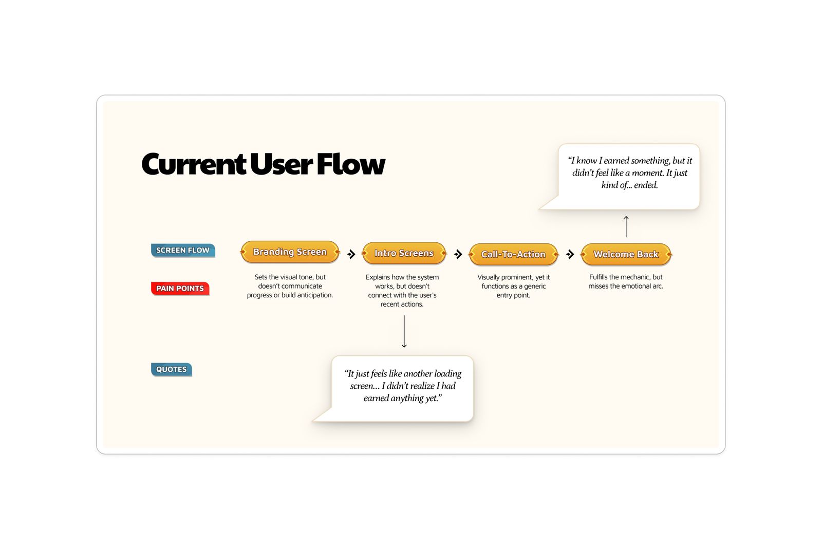
Monster Walk turns real steps into character growth, quests and progression. Early engagement in the beta was strong, but players who lapsed for 7+ days weren't returning. The Welcome Back screen was the only way back in, and it wasn't designed for someone who felt guilty or worried their progress was gone.
Audit
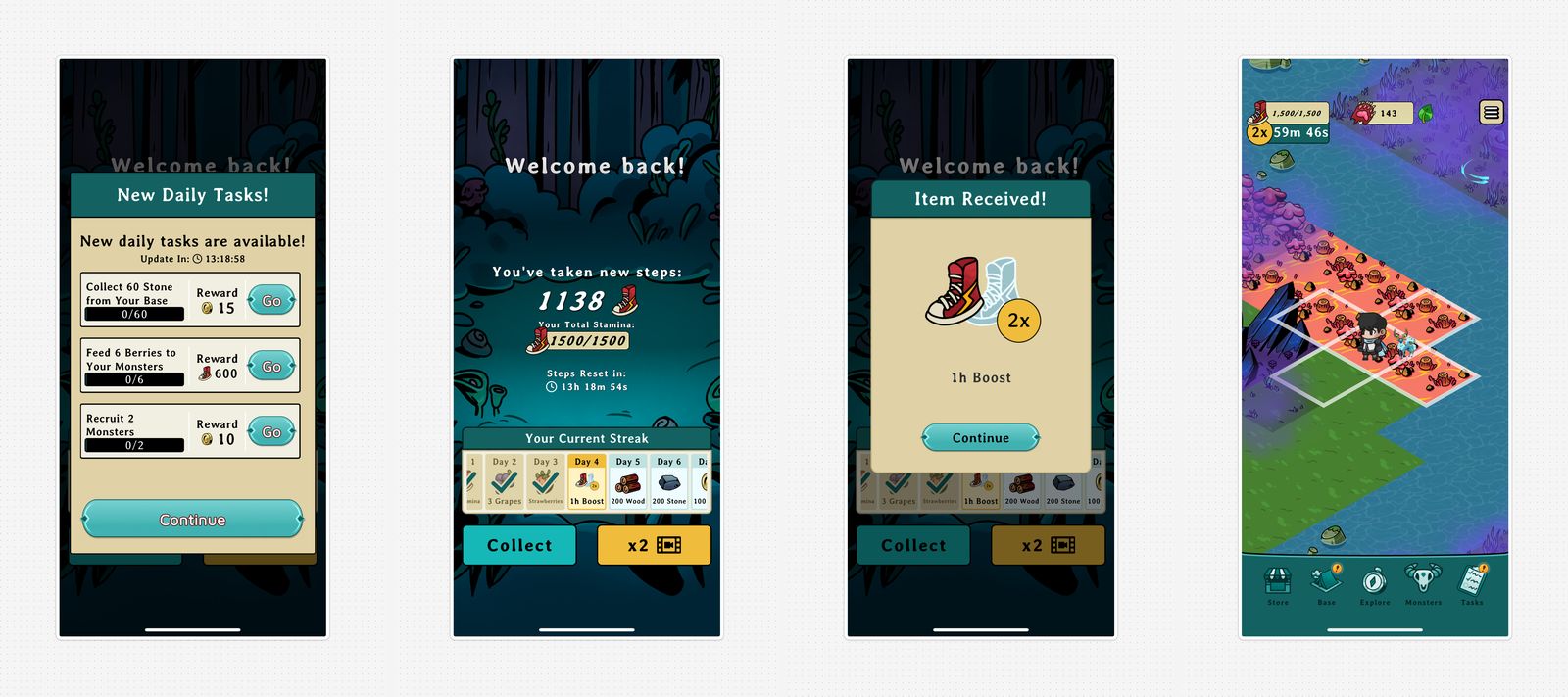
Players saw a daily task panel before any sign of their progress, then steps and stamina with no clear sense of what they turned into, then a reward in a separate overlay. By the time they reached the game world, the next action was unclear.
Research
Research included interviews with the founder, coaches and a gaming advisor, conversations with lapsed power users, a review of Duolingo, Pokémon GO and Habitica, and input from gaming psychology experts on re-engagement.
Every lapsed user worried their progress was gone. None of them had checked, and that worry was the main thing stopping them from returning.
Returning players needed to feel welcome before anything else. The competing apps all showed saved progress before new features.
Concepts
All three use elements already in the game. Each squad leader speaks in their own tone, Mystery Monster adds surprise, and streaks encourage coming back.
Silent clips from the concept prototypes.
The pivot
The first round was an A/B test. It mostly showed drop-off rates, with little insight into why. Testing with non-gamers didn't work either: the game was hard to explain, and people dropped off in the first few screens. So testing shifted to concept sessions with power users, which showed what players liked and wanted, well beyond the welcome screen. The CEO valued the same insight.
Testing
Moderated sessions with lapsed users included follow-up questions about their reactions. The testing was qualitative, so the concepts weren't scored. The patterns were consistent:
Mystery Monster's pull came from the thrill of finding out who players might set free to join their squad, which helps them level up. It works with the game's own mechanics.
Final solution
This is the interactive prototype. Tap through a player's return, from collecting stamina to the in-game map.
Open it in Figma Watch the public game trailerKey decisions
I mapped every screen a returning player saw, so I knew where the friction was before drawing any new concepts.
The A/B test only showed drop-off, and non-gamers struggled to understand the game. I moved to concept sessions with power users, which showed what players liked and why, well beyond the welcome screen.
I built the squad leader greeting concept from characters already in the game, so it felt native to the game. I gave each leader a distinct tone for welcoming players back, and built an inventory of welcome-back lines in each leader's tone for the welcome page. It was the concept I pushed for hardest, and it's live in the launched game.
What made it into the game
Squad leaders now greet players in their own voice.
Outcome
Monster Walk launched two months after the internship ended. These recommendations were in the live product:
There was no access after launch, so there are no live retention metrics to report.

Mobile UX
A redesign of Philadelphia's transit app around what riders do most: buy a ticket, plan a trip and follow it live.
The problem
Riders get logged out at the exact moment they need directions. People depend on transit to get to work and to medical appointments, so when the app fails, it affects their day.
Research
Interviews, a heuristic evaluation and usability tests fed an affinity map of pain points. Three findings set the direction.
Every commuter interviewed kept Google Maps open while using SEPTA, because the app had no integrated map.
Login failed in 6 of 8 test sessions, and failed logins made people doubt the app was reliable.
Finding a schedule took 4+ taps through menus labeled "Schedules," "Trip Planner" and "Routes," and people still couldn't find their route.
The direction
Riders plan by where they are and where they need to go, so the structure was rebuilt to answer that first. Extra items in the nav bar and separate destination search and filters were folded together, leaving fewer places to look.
Final solution
This is the interactive prototype. Step through a trip from Drexel to Fishtown, from Face ID sign-in to live directions.
Open it in FigmaKey decisions
Riders look up destinations on a map, and were juggling SEPTA and Google Maps to do it. I put the map on the home screen to remove the juggling and give an overview at a glance. It meant rethinking the whole information architecture and risked overwhelming people who wanted a quick schedule lookup, but testing showed even those riders pictured the trip on a map first.
Riders stopped relying on the app when sign-in failed mid-trip. I designed sign-in around Face ID, with a password as a fallback, so getting in takes a second.
Riders saw "Schedules" and "Trip Planner" as one task, so I merged them into a single search with predictive text. Finding a route takes 2 taps instead of 4+. I made ticketing a persistent primary action, so riders who already know their schedule can buy or activate a ticket without going through trip planning. That cut a purchase from 7 steps to 3. The single search does favor riders who already know where they're going; someone who only wants to check a schedule may take an extra step.
I folded the extra nav items and the separate destination search and filters together, so riders have fewer places to look and every tab maps to a task.
Task success in usability testing
45%92%
Outcome
In usability testing, all 8 participants bought a ticket without help, and people could plan a trip without leaving the app.
Shortly after the project, SEPTA released a revamped app with biometric login, map integration, predictive search and improved accessibility controls, the same needs this research had pointed to.
This was a student project without access to SEPTA's backend systems or usage analytics.
Next steps
Research covered only daily commuters. A real rollout would recruit a wider range of riders from day one, especially people with disabilities.
Product design, 0 to 1
A gamified learning platform that teaches adults life skills like filing taxes and renting an apartment through interactive modules.
The problem
Filing a tax return, reading a rental lease or understanding a mortgage usually gets learned the hard way. Adult You set out to teach these skills through play. It began as a vision from a CEO with deep experience in educational content, so the content, modules and structure were shaped from the ground up.
Product discovery
The work started from content: sample modules, card parsers to simulate real interactions, and example flows the team could review, with quick wireframes alongside to show how it would look on screen. That gave everyone something concrete to react to and set the product direction.
The pivot
The first version of the modules was text-heavy. Adult life is hard as it is, and topics like budgeting can be intimidating. Design exploration and testing made the case for a game: content broken into smaller interactive segments that are easier to digest, progress tracking and achievements, and each module structured as something to play through. It took many rounds of iteration to get there.
Final solution
This is the interactive prototype. Step through a module: make a quick guess, see the answer and its source, then move from Bud to Bloom. Growth is the core of Adult You, and a tree's bud, bloom and blossom stages show users where they are and what comes next.
Open it in FigmaKey decisions
I broke lessons into small interactive segments with progress tracking and achievements, so tough topics feel approachable and each step builds on the last.
The game mechanics needed components no existing UI kit had, so I built the system from scratch for the interactive Unity modules. It covers reusable components, interactive buttons, gamified image states, module patterns, UX principles and branding direction in Figma. The Unity alpha build uses it today, and it let developers build in parallel with a clear reference.
Working closely with a hands-on CEO, I used prototypes and test findings to anchor design and testing decisions. They gave everyone something concrete to react to, made the product clearer, and sharpened the CEO's pitch too.
With the product still taking shape, design was expected to set the direction while module content kept evolving, and each content change meant reworking the module screens. To keep the work focused, I proposed a shared content review as the first step for every module: the team agreed on the content together, then I wireframed. That cut out repeated rework and kept the project on track for usability testing.
There were no examples of gamified adult education to point to, so I explored button hierarchy and module layouts quickly in Figma Make. I reviewed and refined every output before it went into the design.
College students are a big part of the target audience, and a partnership with Drexel University made them easy to reach. I set up the session to double as a workshop for the students on running in-person usability tests.
Testing with 20 college students
75%
Testing
Testing ran in two rounds: first with the internal team, then with 20 college students. It also surfaced:
After testing, the text was cut further and the modules shifted toward interaction-first learning. This groundwork shaped the alpha build.
What carries forward
Agreeing on requirements up front, in a PRD or something like it, answers questions before they slow the work and gives everyone the same expectations. Being the only designer also built a habit that carries into every project: backing each structural decision with prototypes and test findings.